Your Choice Mental Health Therapy
We worked from the ground up to establish a unique brand and identity that reflects their mission and values.

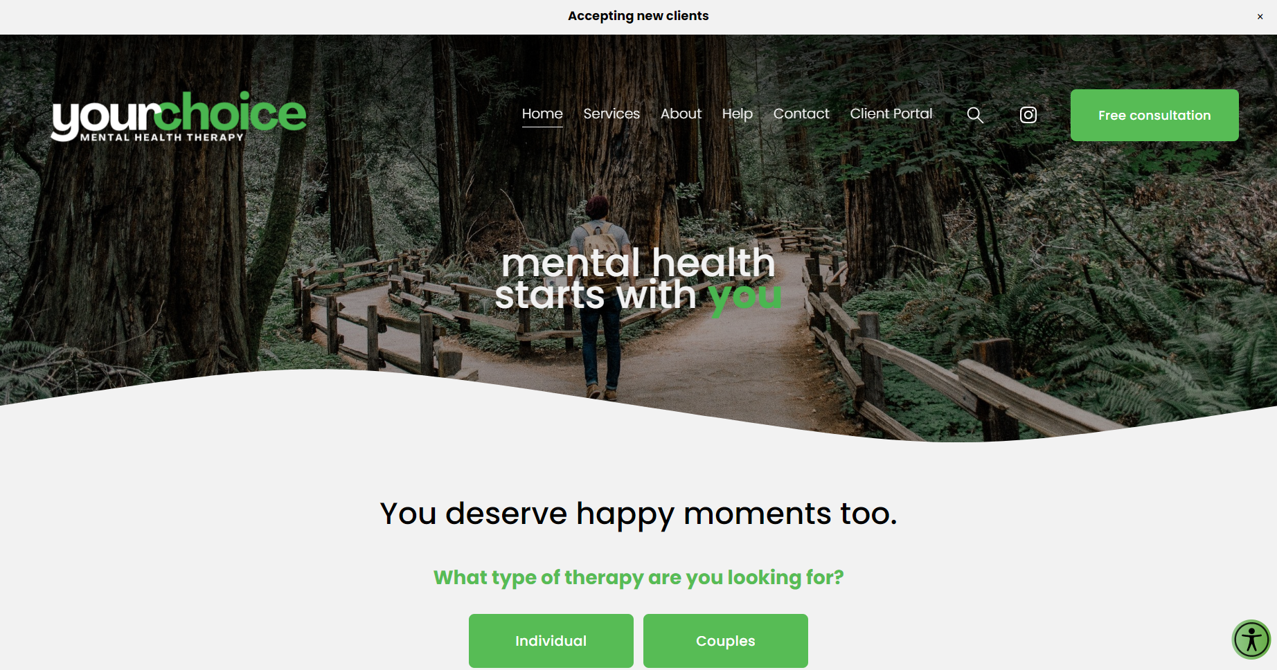
Our design process began by carefully selecting colors that aligned with our client's preferences and brand identity. We chose natural greens, crisp whites, and soothing grays to create an inviting and calming atmosphere on their home page. Our team understands the importance of color in branding and design, and we work closely with our clients to ensure that their color choices reflect their brand messaging and values. By incorporating natural greens and crisp white and grays, we were able to create a visually appealing and engaging home page that accurately represented our client's brand.

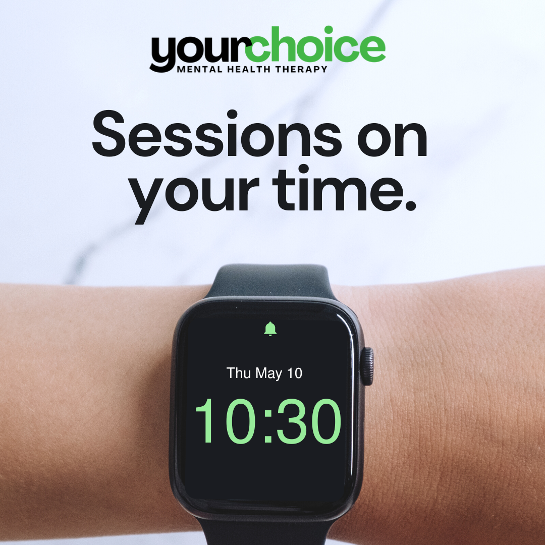
Our team successfully integrated our client's unique branding and identity across various social media platforms. By carefully adapting their brand messaging and visuals to each platform, we were able to create a cohesive and engaging online presence for our client. We understand that every brand is unique, and we approach each project with a creative and collaborative mindset. Our team worked closely with our client to ensure that their branding and identity were accurately represented across all social media platforms.

Our team collaborated with our client's team to identify their needs and objectives for resource materials. Based on their input, we recommended rack cards as an ideal option that would be both user-friendly and easy to understand. As you can see from the end result, our recommendation was successful in meeting their goals. The rack cards fit perfectly in their lobby and provided their visitors with valuable information in a clear and concise format. Clients take them home since they are easy to store and the company is happy because we got the cost lowered on production due to the size. It's a win-win.

Our team was able to curate a wide range of branded identities for each social media platform. Here you can see the flexibility of Your Choice's service lines come to life on Instagram.

We're excited to share with you a close-up of the anxiety and depression rack card that our team created for our client. As you can see, the final result is both visually appealing and informative. Our team worked closely with our client to ensure that the content was accurate, helpful, and easy to understand. We also focused on creating a design that was engaging and eye-catching, while still maintaining a professional and informative tone that was true to the branding.

We're excited to share with you a close-up of the LGBTQ+ specific rack card that our team created for our client. As you can see, the final result is both visually appealing and informative to the target population. Our team worked closely with our client to ensure that the content was accurate, helpful, and easy to understand. We also focused on creating a design that was engaging and eye-catching, while still maintaining a professional and informative tone that was true to the branding.
Starting from scratch.
From the initial stages of our partnership, we collaborated closely with the team to understand their needs and goals. We then leveraged our expertise in design and branding to create a remarkable identity that sets them apart in their industry. We're proud to have been a part of their journey and to have helped them achieve their vision for their business.


